RTS user interfaces have stagnated. This is perhaps the main thrust of this article series, and while I won’t discuss all the concepts today – part 3 will deal with AI integration into the user interface, and part 4 with templates and AI and part 7 with strategic zoom. However, the basics if the user interface such as control mode (the mode with visible commands, when you hold down a specific key) will be discussed here.
One particular note here is the usage of vertical and horizontally-orientated UI’s. Not only do vertically orientated UI’s lend themselves to more natural “scrolling”, whereas in the past screen screens were commonly i.e. 1024*768 – which is 4:3 – modern “HD” 1080p screens are 1920*1080, which is 16:9. In other words, between those resolutions you have 78% more width, but only 41% more height! Thus, vertical screen space is “cheaper” than horizontal.
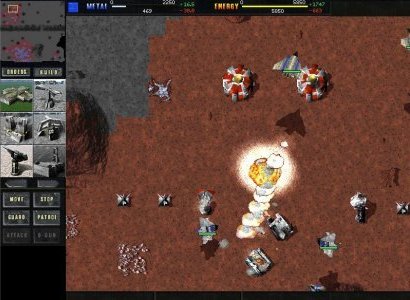
In any case, Total Annihilation’s interface remains an interesting case study. It, while certainly showing its age, is reasonably clean and uses a fairly low amount of real space – while more modern interfaces “float” some UI panels over the main window, they do not actually make a huge difference to the actual view area. You can easily see your resources and resource flow, and you can view and manipulate many things a unit has been previously commanded to do, in a control mode accessed by pressing shift – now a standard in RTS games.
 Total Annihilation’s Interface
It certainly has some drawbacks, of course. For instance, there is no listing of displayed units in any form, and while the builder factory bar is vertically orientated to the left of the screen, it has relatively small and left/right orientated scrolling which makes selecting units/buildings to create relatively laborious. And there’s an inexplicable black bar at the bottom of the screen.
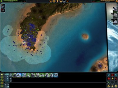
Supreme Commander, on the other hand, is far prettier graphically and is in some –and not other – ways an advance. You can easily see how many units you have selected (screenshot, top right) as well as the full build menu on an obviously scrollable for a tier (centre lower) as well as a permanent commands panel (or rather two split between lower left and lower right – not ideal!), but the play space has pushed the user interface out to the extremes of the screen, and introduced the need for additional icons to display the data. Overall, the screen space used by the two UI’s is similar…but Supreme Commander uses more horizontal rather than vertical screen space!
 Supreme Commander’s Interface
While the additional selected-unit display and larger number of visible units to build is welcome, much of what players want to do can now only be accomplished remains dependent on clicking on buttons, especially for units – and there are more in Supreme Commander – which require intelligent micro-management.
There are also issues with, for example, accidentally including a single transport in a group of units given a move order, they will wait while the transport shuttles one load at a time, rather than there being a separate “transport” order. You can also set up “transport points”, but only for the currently selected units!
Another interesting example is Homeworld: Cataclysm, where there is a minimal interface, but a powerful, three dimensional control mode. This builds on Homeworld, where you could not give orders directly in the strategic map, but the interface remained relatively clean. In some cases you needed to access other screens to do actions, but you spent most of your time in the main screen with its minimal UI.
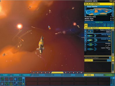
Homeworld 2 – and even more so the “remastered” versions of Homeworld 1/2, on the other hand, introduces a large bank of orders and a complex build screen which the player must pay attention to. While it does not remove the player from the main screen to build, it requires more attention – and is far from the best way to handle this, and severely restricts the main screen area for a UI element which will remain open for much of the game. In addition, the selection and command interface still uses vertical space – and can be unfavourably compared to the HW1/HC:C textual list of units selected.
 Homeworld 2 Interface
So, as we are Building A Better RTS, what are the basic UI concepts we want to use?
- Use primarily vertical screen space
We have considerably more vertical than horizontal screen space on modern monitors, and the UI should be designed to use it. Moreover, rather than trying to cram everything you can build in, let the player scroll – using the scroll wheel over the build ui – to lesser used or rare/powerful buildings or units.
- Offer keyboard shortcuts for all orders
Forcing the player to select orders from small buttons on the interface is fiddly and annoying.
- Inform the player what he’s doing
Give the player a comprehensive command view – holding down shift, as is the standard set by TA and SupCom. He should also be able to see at all times the units he has selected and the groups of units he has set up. Let him chose between – or both of – icons (as Supreme Commander) and names (as Homeworld 1/Cataclysm) for that selection. There should always be a way to cancel orders before they’re given. (i.e. if you drag a move-area order out, the esc key should cancel it rather than you having to give the order, and then another one to stop them).
- Let the player change what he’s doing, even after he’s queued it up.
In the control view, the player should be able to see and revise any command he has given a unit. This is a delicate balance between showing everything and showing some data only for selected units, but for example you can show a group movement order as a single arrow when not selected, and individual movement when you select the group.
Modifier keys should allow the player to remove and insert orders, rather than needing to cancel a unit’s orders and set up a new orders queue.
- Don’t distract the player for minor issues
Too many RTT games expect the player to dive into fights and use minor individual unit abilities. While this is great for a RTT game, often it is a distraction from the wider battle. Excepting truly powerful things like suicide attacks or nuclear bombs, the player should not need to fire individual special attacks. The AI should know when to use the special ability – although the player can and may also trigger it at other times, and use it reasonably well. If it is a minor ability which requires player intervention, then it should be cut.
Equally for player-defined groups of units if you have, say, a unit with a shield sphere in a group, then the unit should take a position on the interior of the group without the player needing to micro-manage it to the position, while fast attack units should move to the flanks. As in Homeworld, some general presets which take various common forms (attack, defence, scatter) of formation would be extremely helpful.
This isn’t the same as what seems to be suggested in “Ashes of the Singularity”, a newly announced game (March 2015), where you only get to control blocks of units. This, as in the Total War games, means that you essentially have a few larger units with a variety of internal characteristics rather than individual units. While for some very small units – fighters or infantry – it may make sense for you to order up squads rather than individual units, this seems like one sacrifice “too far” for a high unit count – which while important, is a tool rather than an end in itself.
These are all things which have been done in the past, but there also are many things you can improve in your UI which have not been done either wholeheartedly, consistently or together by any major commercial RTS.
- Area Commands
All commands (except “stop”) can be given for an area, changing their meaning. Giving an area “move” command to units means they will patrol through the area, an “attack” command means they will seek-and-destroy – “engage” – enemy units within the area, a “reclaim” command given to an area will mean the unit will wander the area, reclaiming all the scrap it comes across, etc.
For transports, drawing two transport zones should make them transport any units ordered to move into one zone to the other connected zone (rather than it being one-way), as well as orders given to the units to directly board the transports in questions.
A non-exclusive list of what might work is as follows;
| Single Command | Area Command |
| Repair/Reclaim | Support |
| Move | Patrol* |
| Attack | Engage* |
| Guard | Defend |
| Load/Unload | Transport** |
* – The difference is that a patrolling unit will focus on moving and exploring even when attacked, while a unit set to engage will focus on fighting any discovered enemy!
** – You’d need to set these up in pairs, which makes it a little less intuitive, but that is still far easier to use than other RTS game transports!
- Divorcing direct builder control
This is not a new concept per-se, it has been used in games such as Dungeon Keeper. You chose your building from the UI – from the list of currently available buildings – and place it down, and build units go and build it. You would be able to use modifier keys to set high or low priority if you wish, or simply take a build unit and give individual builder units direct orders, taking it out of divorced control and giving it direct orders.
With divorced control, you need to worry far less about micro-management of your base units, allowing truly strategic decisions. Upgrades should also allow you to simply place the higher level unit on top of the older one, and a builder unit will accomplish this as with any build order.
(It is arguable that units should be able to build their own higher-echelon upgrades, but this has the problem of bypassing the general tech tree, and is in any case less necessary with this concept)
The UI will show, at any time, the number of each kind of build units idle, building and on direct orders, and let you select any number of each category, or jump the camera view between the locations of the build units.
- Divorcing direct unit production
Directly related to divorced direct builder control, with divorced unit production you select how many units you want, where you want them and can then tab through – if you wish – the factory “zone” (nearly factories will place themselves into a zone, or you can define this with groups yourself) which will produce the units. You won’t be able to select units for building until at least one building capable of producing them has been created.
Of course, manually giving orders to a factory will take it out the build queue as well.
- Assigning orders to groups, as well as groups to orders
The player should be able to set up an order or series of orders by selecting a save spot for such. Those orders can then be assigned to any group of units the player selects. While this is done for waypointing in some games, this concept refers to being able to do this with any commands to any units (they will simply ignore orders they cannot perform). You can set up the attack run on the rear of the enemy base while you’re waiting for the units for it to finish building!
This should again be accessible by saving commands to hotkeys, and being able to send units on those orders via a modifier key on those hotkeys.
Finally, I’d like to again address a concern often heard with these concepts: That you’re handing too much power over to the gam, which plaut you rather than playing it. While this might be true for a RTT game, for a RTS you want the player to be able to focus on the bigger picture rather than his click per minute rate…and there’s this pesky thing which will mess the player’s neat orders up anyway; the enemy!
These are, of course, not the only important elements or improvements to be made to a RTS the UI, but this is a good overview of the key principles and enhancements I would place into the basic UI of a RTS game. If you have comments, suggestions or criticism, please do contact me about them!
